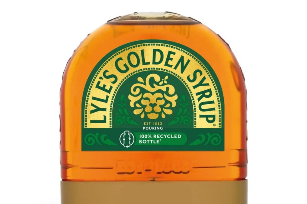
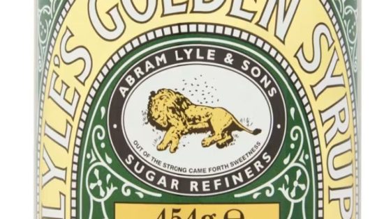
Tate & Lyle has been forced to come out fighting after it was accused of buckling to “woke rebranding” by dropping its Christian-inspired Lion logo.
The British food supplier changed its image from a dead lion being swarmed by bees to a friendly-looking lion and a single bee.
The original faith-inspired logo has been unchanged since 1883.
Lyle’s website confirmed its original logo had strong religious connotations due to the brand’s religious views.
The original faith-inspired logo was unchanged since 1883
TATE & LYLE
The image was originally depicting the story of Samson from the Old Testament.
Samson said: “Out of the eater come forth meat and out of the strong came forth honey.”
Tate & Lyle used the second half of the phrase on the original branding for the golden syrup.
The decision sparked outrage on social media, with one user saying: “Have you ever read such nonsensical rubbish in your whole life?”
LATEST DEVELOPMENTS:

A view of the Tate & Lyle Sugars, Thames Refinery factory
PA
Another wrote: “Woke brigade forces Lyle’s Golden Syrup to change logo.”
A third added: “Apparently anti-Christian bigotry can just go unchallenged.”
Responding to criticism, the company confirmed it’s looking to accommodate to changing times.
James Whiteley, Brand Director for Lyle’s Golden Syrup, said: “While we’ll continue to honour our original branding with the heritage tin, consumers need to see brands moving with the times and meeting their current needs.
“Our fresh, contemporary design brings Lyle’s into the modern day, appealing to the everyday British household while still feeling nostalgic and authentically Lyle’s.

Lyle’s Golden Syrup rebrand has raised some eyebrows
TATE & LYLE
“We’re confident that the fresh new design will make it easier for consumers to discover Lyle’s as an affordable, everyday treat, while reestablishing the brand as the go-to syrup brand for the modern UK family, featuring the same delicious taste that makes you feel Absolutely Golden.”
The rebranded packaging will take place on products in the coming weeks, excluding the classic Lyle’s Golden Syrup tin.
It will feature on full-sized bottles, breakfast bottles, dessert toppings and golden syrup portions.
Tate & Lyle Sugars was sold to US firm American Sugar Refining in 2010.
Source Agencies


