Apple has a history of delivering devices that are faster than the competition, but when comparing its own products, there’s always a lingering question: Is the fancy new gear worth an upgrade? I often find myself telling folks to buy the M1 iPad Pro, the iPhone 12 Pro, or a previous-gen Mac with an M-series chip — and save some cash.
It’s a testament to just how well Apple hardware fares in the long run, especially when compared to rivals. If you look at it from a different perspective, it’s hard to feel the difference in an iterative Apple upgrade. I felt the same when I jumped from the iPhone 14 Pro to the iPhone 15 Pro or when I ditched a perfectly fine M2 MacBook Air for its M3 variant this year.
You don’t feel a difference, and certainly not one that’s worth the extra money you are paying for the latest addition to Apple’s portfolio. Things are different this year. This new iPad Pro is here to upend perceptions, and it does so quite handsomely. I have a love-hate relationship with the iPad, and I rarely suggest splurging on it without a very specific — and practically demanding — reason to back that cash burn.
In 2024, I have slightly different thoughts. I plonked some serious cash — over $2,000 — to get the new 13-inch iPad Pro with the M4 chip, alongside the redesigned Magic Keyboard and the Apple Pencil Pro. From the get-go, this one feels like a leap forward. A true generation-over-generation upgrade that commands a worthy premium. This is peak Apple hardware.
The new iPad Pro is quite something
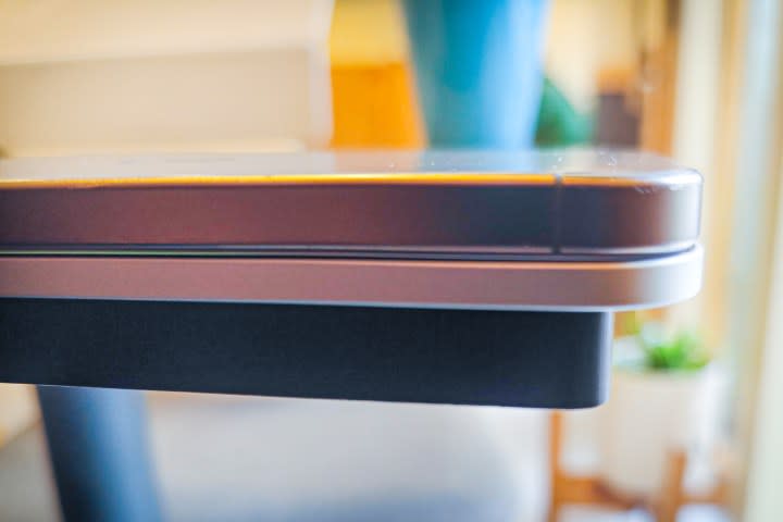
It all starts at the design. It’s still unmistakably an iPad in all its metallic glory. Apple says it’s the thinnest device the company has ever made, reaching a cross-section profile of just 5.1 millimeters. But you need to hold the new iPad Pro in your hands to realize that a machine with M4-tier firepower, fantastic speakers, and a great display shouldn’t be this sleek.
It looks and feels stunning. And so does the display. From the moment I started with the setup, I could feel the pleasing saturation on the background wallpaper. A few HDR videos later and I can say this is the nicest panel I have ever worked with. It’s bright, offers terrific viewing angles, and delivers the kind of sharpness that would make you want to gaze at it.


Upgrading from an LCD panel on the M1 iPad Pro, the boost in sheer visual brilliance was stark for me. I put the Asus ZenBook S13 OLED side by side with it, and I can definitely say the laminated OLED panel on the iPad Pro just feels better. Inviting, dare I say, would be the better word. You don’t come across a screen so fine that it makes you want to work. Or at least, that’s what my impression of the iPad Pro has been so far.
Faster than it needs to be
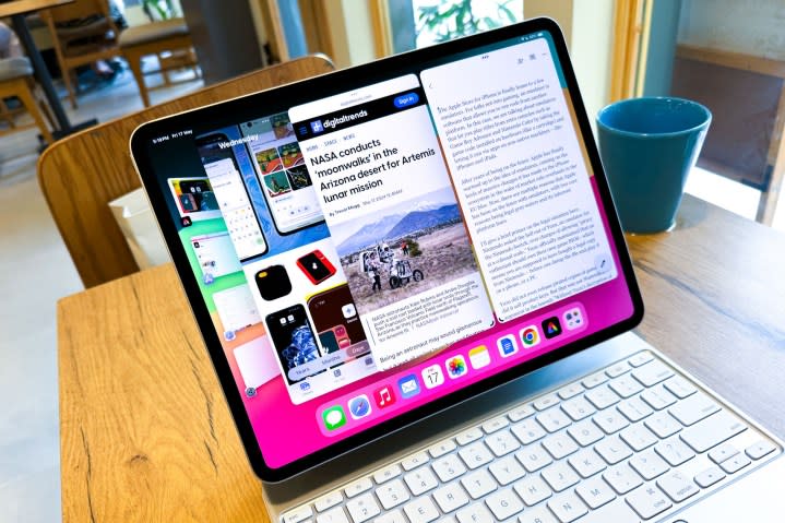

But the real beauty rests inside the recycled aluminum enclosure. The M4 chip is here, marking the first time that Apple chose a tablet to introduce all-new M-series silicon. The intentions are clear: Apple wants you to approach this machine as more than a workhorse, as long as your workflow falls in its territory (which is pretty limited) and you’re not eyeing just another screen for Netflix and YouTube.
The performance gain is brazenly evident here — more so than any iPhone or Mac jump I’ve made over the past six or seven years. Switching between Lightroom and a cluster of Teams, Chrome, and Asana in Stage Manager was amazingly fluid. I can confidently say it felt snappier than the M3 MacBook Air, but it may also be due to the whole mobile-desktop platform disparity.
Compared to the M1, the speed gain is undoubtedly evident. In a few scenarios where I was engaged in cloud-tethered creative tasks, like applying assets on a video timeline in Adobe Express, the whole flow felt faster. I then burned an hour on Diablo Immortal and Devil May Cry: Peak of Combat. Once again, the experience was incredible.
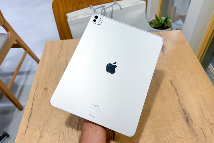

This 120Hz screen is also now ready to support hardware-accelerated ray tracing, so AAA titles that push the boundaries of the Metal API will be eye candy on this machine. The four-speaker array delivers arguably the best sound you can get from any tablet in 2024.
Another neat change this year is the horizontally aligned front camera. For a machine that Apple wants you to believe is as good as a computer, this is a natural place for a webcam. I hated the angle-corrected camera feed for video calls on previous-generation iPads, where the Face ID module was on the portrait edge. Talking about cameras, though, the ultrawide camera on the back is gone.
I haven’t had the chance to test out the battery longevity yet, but I’m curious to see how the added stress of powering an OLED screen and a faster chip works out. I’ll save that aspect for our review. But the M4 iPad Pro is a curious machine, as it baits you into splurging more on the whole package (the iPad and its new accessories). It’s an unfortunate caveat, but that’s the cruel beauty of living the iPad Pro life.
Beauty lies in the bundle
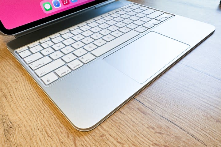

This year, that pricey poison is a tad more palatable. The Magic Keyboard costs the same as its previous iteration, but a few changes have been made, inside and out. Interestingly, it feels like a more substantial overhaul than the iPad Pro itself. This should always have been the ultimate form of a keyboard accessory that costs this much — still $299 for the 11-inch model and $349 for the 13-inch one. It’s just unfortunate that it took Apple so long to realize it.
The new Magic Keyboard embraces three key changes, all of them meaningful. The first one is the addition of a full-function row key, complete with an escape button. Not having to pull up the control center for something as basic as brightness adjustment and media control is a convenience that only those who have suffered will appreciate. My favorite, however, is the dedicated Spotlight key.
For a person whose professional life is separated across multiple workplaces, each with its own set of app preferences, I love the quick route to Spotlight search for launching apps without ever reaching for the trackpad. As far as the typing experience goes, the 2024 Magic Keyboard feels terrific. I hit my usual typing speed within minutes of launching Google Docs on it.
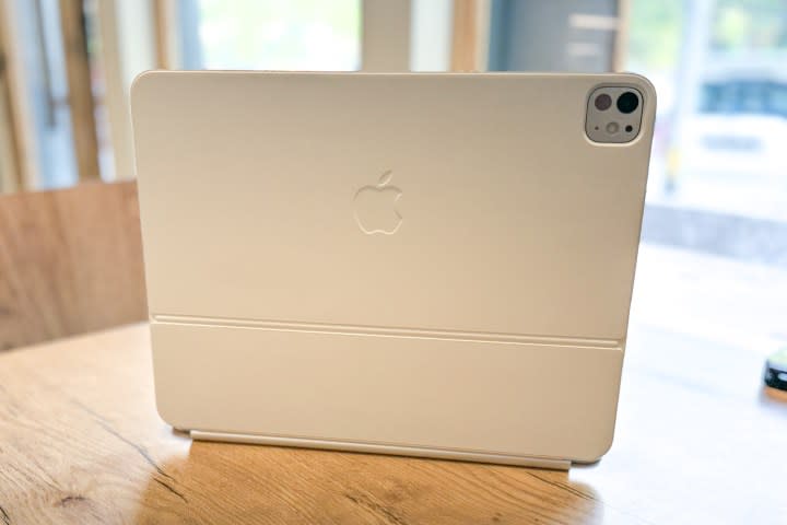

The aluminum deck is definitely more premium to the touch and looks better, too. In my experience, the metal enclosure seems to have added an extra dash of basal stability to the deck while typing. Apple has also flattened the ridge and it now leaves the metallic side exposed. I dearly hope these metallic elements can finally redeem the Magic Keyboard from the curse of peeling skin on the older version. It looked ugly and is a mark of shame for Apple’s engineering.
Finally, we have the trackpad, which is now bigger and covered in glass. Both of them are desirable traits, and they definitely make the whole experience more functionally liberating. The clicks feel more balanced and uniform across the trackpad’s entire area, while the addition of a haptic engine underneath is yet another sweet perk.
I have also had the chance to play with the Apple Pencil Pro. The addition of Find My support is one of the most meaningful upgrades. Support for squeeze and haptic feedback also comes as a nice surprise. So far, the experience has been familiarly smooth sailing, but I look forward to testing the new barrel roll system in sketching apps.
Limited only by Apple’s will
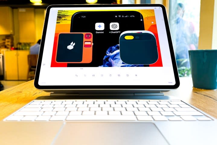

Overall, I feel the M4-driven iPad Pro is the finest device Apple has ever made — one that skips over the usual “Apple cutbacks” we have come to expect from the brand’s hardware. It’s almost a complete slate, in a complementary way, that is. One needs to pair it with the new Magic Keyboard to get a grasp of the full evolution.
It’s a polished machine, through and through, covering all the fundamentals in a luxuriously thumping fashion. In an ideal world, this should fly off the shelves. But the reality check is still here. That reality check is that iPadOS is a criminally hobbled operating system that doesn’t do justice to what the iPad Pro hardware ecosystem brings to the table. Oh, did I tell you Apple won’t let you manually play with the keyboard backlighting? Ugh!
I am hoping Apple’s Worldwide Developers Conference (WWDC) is not all about the AI razzamatazz. After being an ardent iPad Pro user for the past two years, I am impatiently waiting for more desktop-tier iPadOS enhancements to do justice to the iPad Pro’s hardware. For now, we’re stuck with a terrific machine married to an OS that just can’t keep up. And I’m afraid that the status quo is not going to change anytime soon.
Source Agencies


