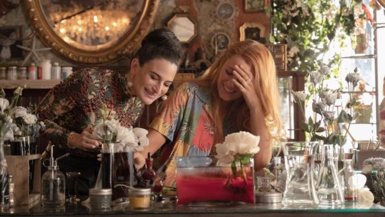
With a name like Lily Blossom Bloom, becoming a florist is the natural path for Blake Lively‘s character in “It Ends With Us.” Colleen Hoover’s 2016 novel provides detailed description for the protagonist’s flower shop — aptly named “Lily Bloom’s,” which has a dark, gothic feel as opposed to the typical rosy hues associated with flora.
The film’s production designer Russell Barnes pored over the book to make sure he got the shop just right. “I had a well-worn, dog-eared copy of ‘It Ends with Us’ that traveled with my wife and me through Costa Rica and Nicaragua as we took turns reading it. Eventually, it found a home in our art department, where it became stuffed with different colored Post-it notes, extensively highlighting characters, locations, design elements and Easter eggs for the viewer. Importantly, it included store and floral-specific notes that mentioned the use of leather, dark gothic colors and steampunk design. Colleen’s rich descriptions sparked initial conversations with Justin about the look and feel of the store.”
Building a location that’s been pictured by readers in millions of different ways certainly added a layer of pressure to the design process, but Barnes and his team were up to the task. “We were very mindful of the fans, making a strong effort to stay true to the book whenever possible. When a book is adapted into a film, adjustments have to be made specifically for the visual medium, which sometimes leads to necessary deviations. We were conscious of this, so at each stage, we presented ideas to the entire creative team, constantly asking, ‘Does this fit our character?’”
Screenshot – Sony Pictures
Barnes fondly recalls working with Lively and director/star Justin Baldoni during early stages of the design process, adding, “Justin had a clear vision of the overall aesthetic he wanted, and we drew inspiration from local stores and images found online and on social media. We aimed for a vintage Parisian upscaled shabby chic look.”
When the trio couldn’t find the exact shade of rich oxblood they wanted for the walls, Barnes took matters into his own hands. “Eventually, we decided we needed a slightly different hue that didn’t exist commercially , so I rushed to hand-mix a completely original color that ultimately became the iconic shade seen in the store. We named the color BBB (Baldoni, Blake, Barnes).”
Of course, flowers themselves played a major role in the aesthetic of Lily Bloom’s, and Barnes collaborated with florist Tess Casey and her team from Aisling Flowers. “Obviously, lilies were a key element,” Barnes says. “My favorite flower used was the mesmerizing bird of paradise. This animated flower always brings a smile to my face. We used wisteria extensively, and lavender throughout the store. We generally stuck to darker tones and unique-looking flowers. We incorporated Ikebana throughout, the Japanese art of floral arrangement that embraces sparser and more disjointed compositions.”
Barnes says it’s his hope that viewers can understand the subtext and metaphors his team aimed to display with the art of flower arrangement. “I truly believe we made the most thoughtful and respectful adaptation possible, honoring Colleen Hoover’s creation,” he says. “I sincerely hope the fans feel the same way.”
Source Agencies

